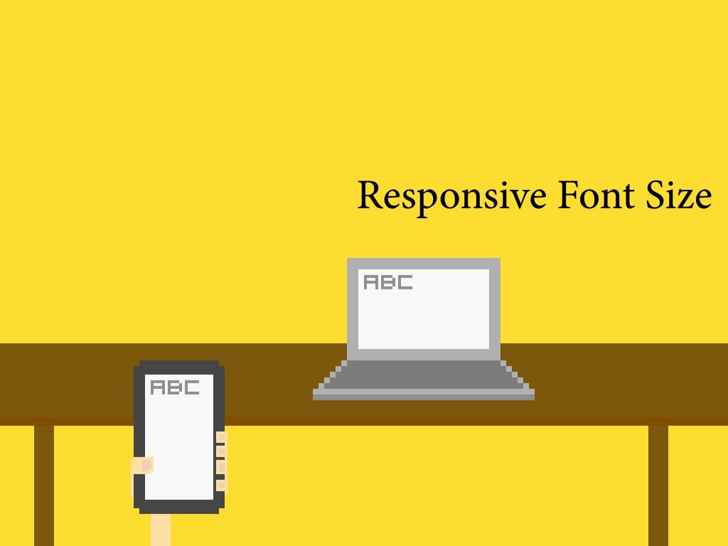
Different font sizes

Dimension of a content box may be flexible and dynamic width based on the screen size. We also need different font sizes for different screen.
The following is the CSS I used in one of my website. I scale the font size for different width explictily.
$font-break-point-wide: 900px;
$font-break-point-medium: 800px;
$font-break-point-narrow: 700px;
$break-point: 560px;

body {
  font-size: 21px;
  font-family: Georgia, serif;
  line-height: 150%;

  @media (max-width: $font-break-point-wide) {
    font-size: 21px;
  }
  @media (max-width: $font-break-point-medium) {
    font-size: 19px;
  }
  @media (max-width: $font-break-point-narrow) {
    font-size: 18px;
  }
  @media (max-width: $break-point) {
    font-size: 16px;
  }

  /* iPhone Retina */
  @media only screen and (-webkit-min-device-pixel-ratio : 1.5)
         and (max-width: $break-point)
         , only screen and (min-device-pixel-ratio : 1.5)
         and (max-width: $break-point) {
    font-size: 16px;
  }
}
We call it adaptive design because we are not scaling the font automatically. Instead, we set the font size based on a certain criteria. The current criteria may mainly rely on the screen size. But actually we also need to consider the screen resolution such as the point-per-inch in the retina display. And the media such as the printing paper. And even the typical distance on how people use that device. For example, when a website is displayed on TV, we are usually feet away from it and we need a larger font-size there.
For example, we used min-device-pixel-ratio and breakpont to define a specific font-size for mobile retina display.