ws-201503–Old website redesign
Media Files
No media files provided.
Background
Company X has been in business for several years but has recently been bought by a new owner. They have an old website which they have used for many years. The new owner has decided that it is time to update and renew the website of Company X with a new version with modern and responsive design.
The new owner is looking to increase their business on the web and needs a design to carry them into the next decade.
Requirement
Your task is to redesign a website and create a new responsive version that is designed to work on several devices with different resolutions. The responsive website should provide an optimal viewing experience for users accessing the website with a computer, tablet or smartphone.
You have been provided with the Company X old website where you can find the company logo and the basic information about the company.
You must re-use the company logotype; keep original colors and structure of company logotype/identity, which has been with the company since it was founded, company description and original logotype provided in media files. You must also use all the text and information on the old website and incorporate that into the new designs. While all information must be included it is up to the competitor to organize and design how the information is presented and organized on the new re-designed website.
You can use your creativity to create additional content or media. You can also make changes on all provided images.
You should create mock-ups of your re-design to present in individual files for each of the defined devices and resolutions (width x height):
- Computer - 1440 x 900 pixels
- Tablet - 768 x 1024 pixels
- Smartphone - 320 x 480 pixels
The above resolutions are the devices standard format. Additional space may be used if needed to illustrate scrolling or swiping as required by some devices. If you incorporate menus or other features into your design you may illustrate these by including additional views, either within the design or in additional files. Features and functionality should be self-explanatory, no written instructions are allowed in the mock-up files.
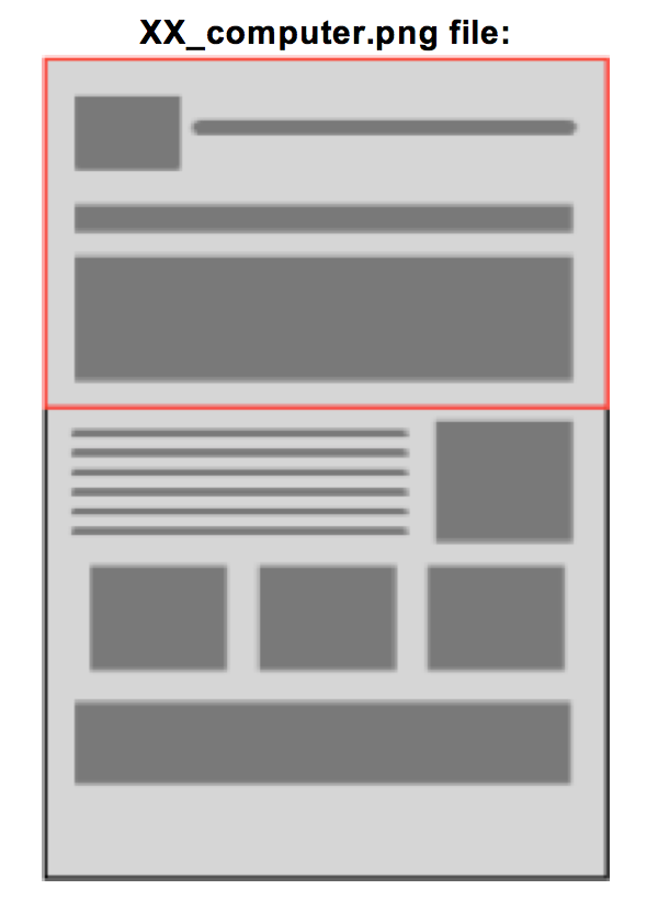
All mock-ups should be presented in real pixels size and must include a red border – equal to or less than 3 pixels wide, showing the device screen border resolution.
The computer design created should illustrate a hover/mouse effects.
Design Mockup
To better present your new proposal to company X, you should create one preview file presenting all 3 mockups. Use the provided template, Mockups_Preview.psd, and place your mockups inside respective screen area.

Media Files Contents
The provided Media Files contains the following Folder/Contents:
- OldCrappyWebsite - copy of old company website
- Company_X - original logotype and company information
- Images - original company images used on old website & additional images
- Mockups_Preview Template - preview template file
- ExtraMediaFiles - additional package of icons and fonts
This is a design module therefore; all interactions should be visible in the design images. Only submitted .png files will be assessed. Your re-design will be assessed by industry standards and needs to incorporate best practice of responsive design.
Help
N/A
Submission guideline
Save your files in your root directory on the server called "XXDesignB" where XX is your country code.
Naming of Files:
- Computer: XX_computer.png
- Tablet: XX_tablet.png
- Smartphone: XX_smartphone.png
- Preview: XXmockupspreview.png
You can create additional images (optional) per resolution to highlight hidden elements, animations or any additional information that will aid in the development of the website.
Naming of additional files:
- Computer: XXcomputer2.png, XXcomputer3.png, …
- Tablet: XXtablet2.png, XXtablet3.png, …
- Smartphone: XXsmartphone2.png, XXsmartphone3.png, …
- Save any source files of images to a folder called "XXsourcefiles" inside "XXModuleB" folder. Source files are the files containing the layers, development files, i.e. .psd/.ai/.jpg/.svg/…
Below you can find an example of a computer view that may be submitted:

Notes
- Test project designed by Arwid Wibom, Sweden.
- This is the Design Test Project for WorldSkills 2015.
- You can use Google Fonts in your design.
- You can use Font Awesome in your design.