Re-visit the minimal website
In this chapter, we revisite the code and add more mobile specific configuration to it. As a recap, here is the original code.
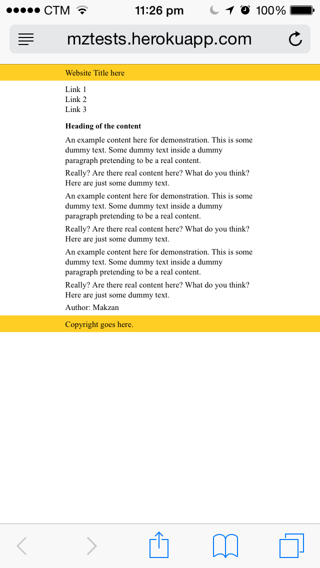
The HTML:
<header>
  <div class="row">
    Website Title here
  </div>
</header>

<nav>
  <div class="row">
    <ul>
      <li>Link 1</li>
      <li>Link 2</li>
      <li>Link 3</li>
    </ul>
  </div>
</nav>

<div class="row">
  <article>
    <header>
      <h1>Heading of the content</h1>
    </header>

    <p>Content paragraphs go here.</p>

    <footer>
      Author: Makzan
    </footer>

  </article>
</div>

<footer>
  <div class="row">
    Copyright goes here.
  </div>
</footer>
The CSS:
/* normalize */
body, nav, ul, li, p, h1, h2, h3 {
    padding: 0;
    margin: 0;
}

/* core styles */
* {
    -webkit-box-sizing: border-box;
    box-sizing: border-box;
}

body > header,
body > footer {
    background: #ffce25;
}

.row {
    width: 100%;
    max-width: 600px;
    margin: 0 auto;
    padding: 10px;
}

/* addition styles */
ul {
    list-style: none;
}

h1, p {
    margin-bottom: .5em;
}
Comments
no comments yet.