Using viewport to define initial browser rendering
Remember that we created a minimal mobile friendly website in chapter 2? Now let’s revise it with viewport and media queries configuration.
Add the following <viewport> tag inside tho <head> part of the HTML.
<meta name="viewport" content="width=device-width, initial-scale=1">
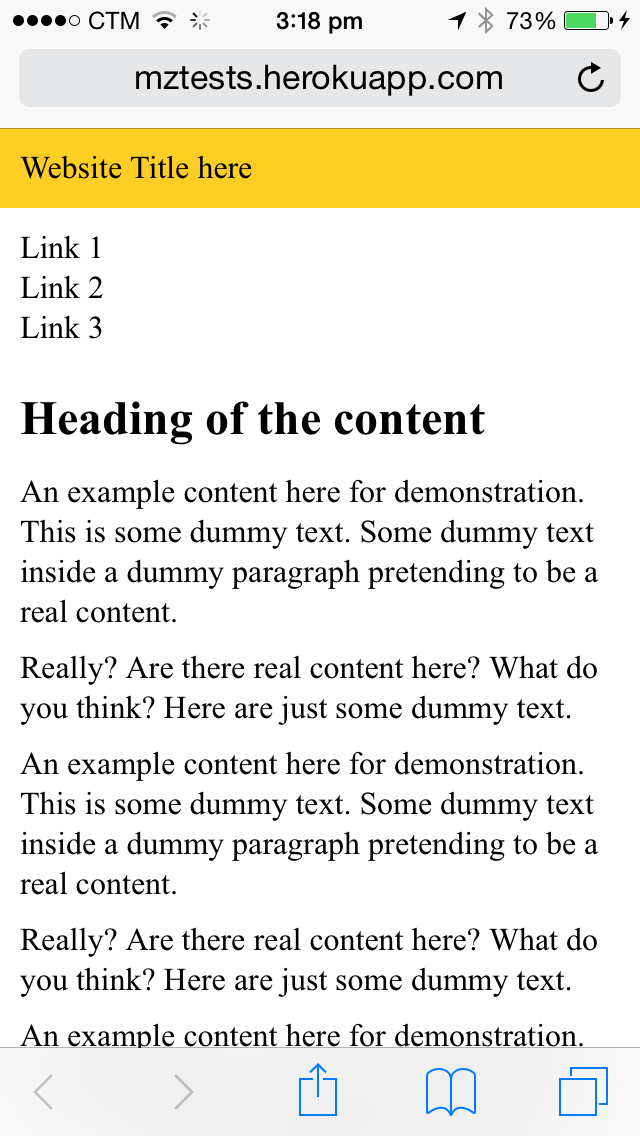
The viewport tells the device, more specifically the mobile device, to use the real device with instead of pretending to be a desktop screen. Before we add the viewport configuration, mobile web browser usually pretends to be a desktop screen with 900 something pixels width. This ensures showing the whole website to the readers and let readers zoom in to the part where they are interested to read. After we set viewport to use the device width, mobile web browser would use the real device width, for instance, 320px in iPhone, to render and disply the website.
QuirksMode provides a detail discussion on how the viewport options.
Comments
no comments yet.