Newest ⟷ Oldest
-
Snapshot at 2017-04-19
Building our own grid system
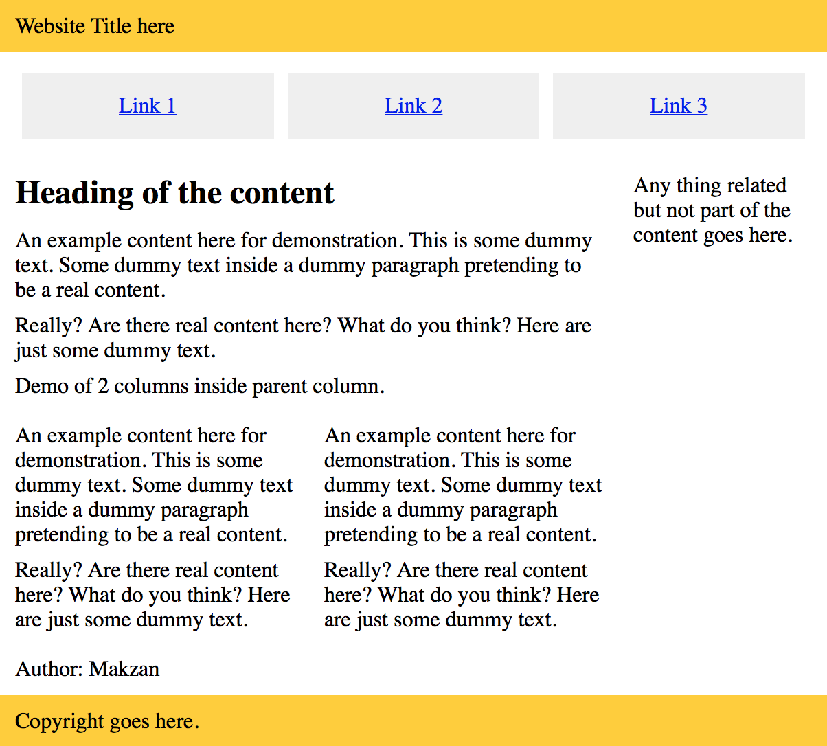
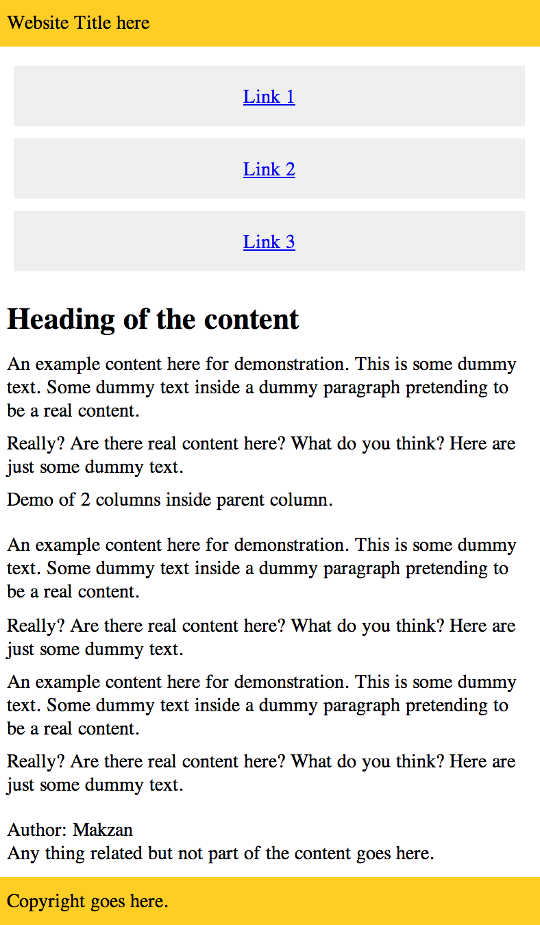
The following CSS demonstrates a minimal grid system I created. It is inspired from the Zurb Foundation and I just keep the most essential part - the basic grid.
You will find that actually it takes less than 50 lines of code to build a responsive grid system with row/column approach.
By creating our own grid system, we learn the core of the row/ column grid. One more benefit is that we can use a basic grid at the beginning of the project. And only include the Foundation framework into the project until we need their rich features.
Video
https://codepen.io/makzan/pen/pPgerL?editors=1100
Code
* {
    box-sizing: border-box;
}

img {
    max-width: 100%;
}

.row {
  width: 100%;
  max-width: 600px;
  margin: 0 auto;
  padding-top: 10px;
  padding-bottom: 10px;
}

.row .row {
  width: auto;
  max-width: none;
  margin: 0 -10px;
}

.col {
  padding: 0 10px;
  width: 100%;
}

@media screen and (min-width: 500px) {
  .row {
    overflow: auto;
  }
  .col {
    float:left;
  }
  .one {
    width: 25%;
  }
  .two {
    width: 50%;
  }
  .three {
    width: 75%;
  }
  .four {
  }
}
And the sample HTML that uses our CSS grid.
<header>
  <div class="row">
    <div class="four col">
      Website Title here
    </div>
  </div>
</header>

<nav>
  <div class="row">
    <div class="four col">
      <ul>
        <li><a href='#'>Link 1</a></li>
        <li><a href='#'>Link 2</a></li>
        <li><a href='#'>Link 3</a></li>
      </ul>
    </div>
  </div>
</nav>

<div class="row">
  <div class="three col">
    <article>
      <header>
        <h1>Heading of the content</h1>
      </header>

      <p>Content.</p>

      <p>Demo of 2 columns inside parent column.</p>
      <div class="row">
        <div class="two col">
          <p>Content.</p>
        </div>
        <div class="two col">
          <p>Content.</p>
        </div>
      </div>


      <footer>
        Content
      </footer>

    </article>
  </div>
  <div class="one col">
    <aside>
      Any thing related but not part of the content goes here.
    </aside>
  </div>
</div>

<footer>
  <div class="row">
    <div class="four col">
      Copyright goes here.
    </div>
  </div>
</footer>
Results
Examples
An example of the grid system with placeholder image.
https://codepen.io/makzan/pen/vmLNOV
An example of using our grid system with the block-grid navigation approach.
https://codepen.io/makzan/pen/EmPVVv
An example of using our grid system with the footer navigation approach.
-
Snapshot at 2017-04-19
Building our own grid system
The following CSS demonstrates a minimal grid system I created. It is inspired from the Zurb Foundation and I just keep the most essential part - the basic grid.
You will find that actually it takes less than 50 lines of code to build a responsive grid system with row/column approach.
By creating our own grid system, we learn the core of the row/ column grid. One more benefit is that we can use a basic grid at the beginning of the project. And only include the Foundation framework into the project until we need their rich features.
* {
    box-sizing: border-box;
}

img {
    max-width: 100%;
}

.row {
  width: 100%;
  max-width: 600px;
  margin: 0 auto;
  padding-top: 10px;
  padding-bottom: 10px;
}

.row .row {
  width: auto;
  max-width: none;
  margin: 0 -10px;
}

.col {
  padding: 0 10px;
  width: 100%;
}

@media screen and (min-width: 500px) {
  .row {
    overflow: auto;
  }
  .col {
    float:left;
  }
  .one {
    width: 25%;
  }
  .two {
    width: 50%;
  }
  .three {
    width: 75%;
  }
  .four {
  }
}
And the sample HTML that uses our CSS grid.
<header>
  <div class="row">
    <div class="four col">
      Website Title here
    </div>
  </div>
</header>

<nav>
  <div class="row">
    <div class="four col">
      <ul>
        <li><a href='#'>Link 1</a></li>
        <li><a href='#'>Link 2</a></li>
        <li><a href='#'>Link 3</a></li>
      </ul>
    </div>
  </div>
</nav>

<div class="row">
  <div class="three col">
    <article>
      <header>
        <h1>Heading of the content</h1>
      </header>

      <p>Content.</p>

      <p>Demo of 2 columns inside parent column.</p>
      <div class="row">
        <div class="two col">
          <p>Content.</p>
        </div>
        <div class="two col">
          <p>Content.</p>
        </div>
      </div>


      <footer>
        Content
      </footer>

    </article>
  </div>
  <div class="one col">
    <aside>
      Any thing related but not part of the content goes here.
    </aside>
  </div>
</div>

<footer>
  <div class="row">
    <div class="four col">
      Copyright goes here.
    </div>
  </div>
</footer>
An example of the grid system with placeholder image.
https://codepen.io/makzan/pen/vmLNOV
An example of using our grid system with the block-grid navigation approach.
https://codepen.io/makzan/pen/EmPVVv
An example of using our grid system with the footer navigation approach.