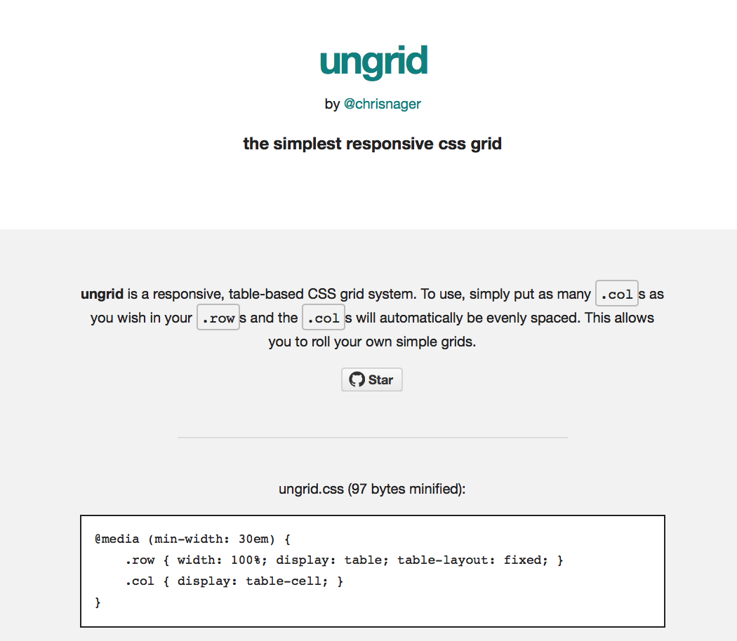
Introducing ungrid
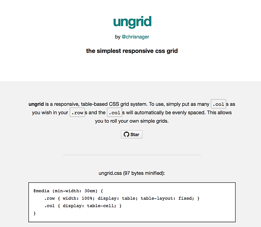
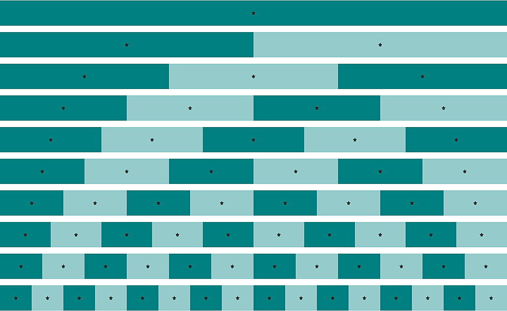
Because table cell is evenly distributed by default, so we just need to define columns and browser would handle the space spreading.
For any column that needs specific width, we can just set the width on that specific columns, using either fixed width or percentages.
@media (min-width: 30em) {
  .row { width: 100%; display: table; table-layout: fixed; }
  .col { display: table-cell; }
}