4-column system with float
The following CSS demonstrates a minimal grid system I created. It is inspired from the Zurb Foundation and I just keep the most essential part - the basic grid.
You will find that actually it takes less than 50 lines of code to build a responsive grid system with row/column approach.
By creating our own grid system, we learn the core of the row/ column grid. One more benefit is that we can use a basic grid at the beginning of the project. And only include the Foundation framework into the project until we need their rich features.
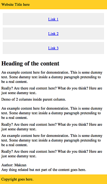
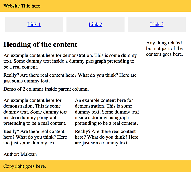
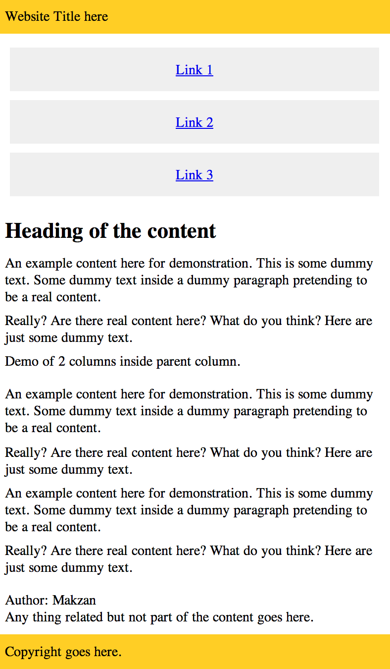
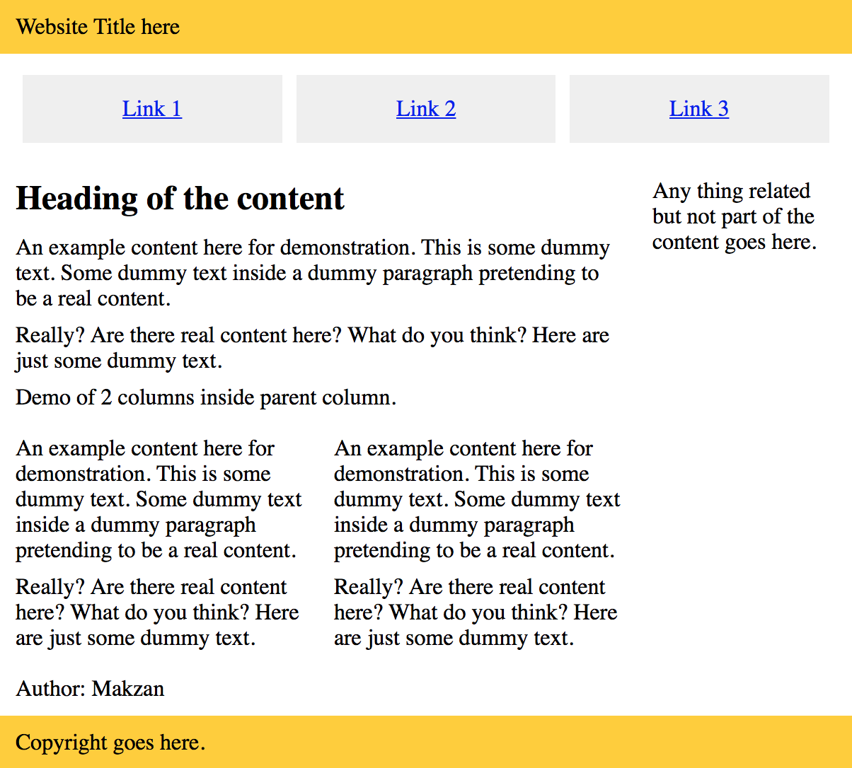
This is the result that we are going to build:
This is the result that we are going to build:
CSS Code
* {
    box-sizing: border-box;
}

img {
    max-width: 100%;
}

.row {
  width: 100%;
  max-width: 600px;
  margin: 0 auto;
  padding-top: 10px;
  padding-bottom: 10px;
}

.row .row {
  width: auto;
  max-width: none;
  margin: 0 -10px;
}

.col {
  padding: 0 10px;
  width: 100%;
}

@media screen and (min-width: 500px) {
  .row {
    overflow: auto;
  }
  .col {
    float:left;
  }
  .one {
    width: 25%;
  }
  .two {
    width: 50%;
  }
  .three {
    width: 75%;
  }
  .four {
  }
}
And the sample HTML that uses our CSS grid.
<header>
  <div class="row">
    <div class="four col">
      Website Title here
    </div>
  </div>
</header>

<nav>
  <div class="row">
    <div class="four col">
      <ul>
        <li><a href='#'>Link 1</a></li>
        <li><a href='#'>Link 2</a></li>
        <li><a href='#'>Link 3</a></li>
      </ul>
    </div>
  </div>
</nav>

<div class="row">
  <div class="three col">
    <article>
      <header>
        <h1>Heading of the content</h1>
      </header>

      <p>Content.</p>

      <p>Demo of 2 columns inside parent column.</p>
      <div class="row">
        <div class="two col">
          <p>Content.</p>
        </div>
        <div class="two col">
          <p>Content.</p>
        </div>
      </div>


      <footer>
        Content
      </footer>

    </article>
  </div>
  <div class="one col">
    <aside>
      Any thing related but not part of the content goes here.
    </aside>
  </div>
</div>

<footer>
  <div class="row">
    <div class="four col">
      Copyright goes here.
    </div>
  </div>
</footer>