2018-09-15
📖 Library
Library with latest short posts and courses.
Latest Tips & Tricks
-
-
2018-09-14
Row and 12-columns grid
Traditionally, we divide our layout into rows. Inside each row, there are 12 columns.
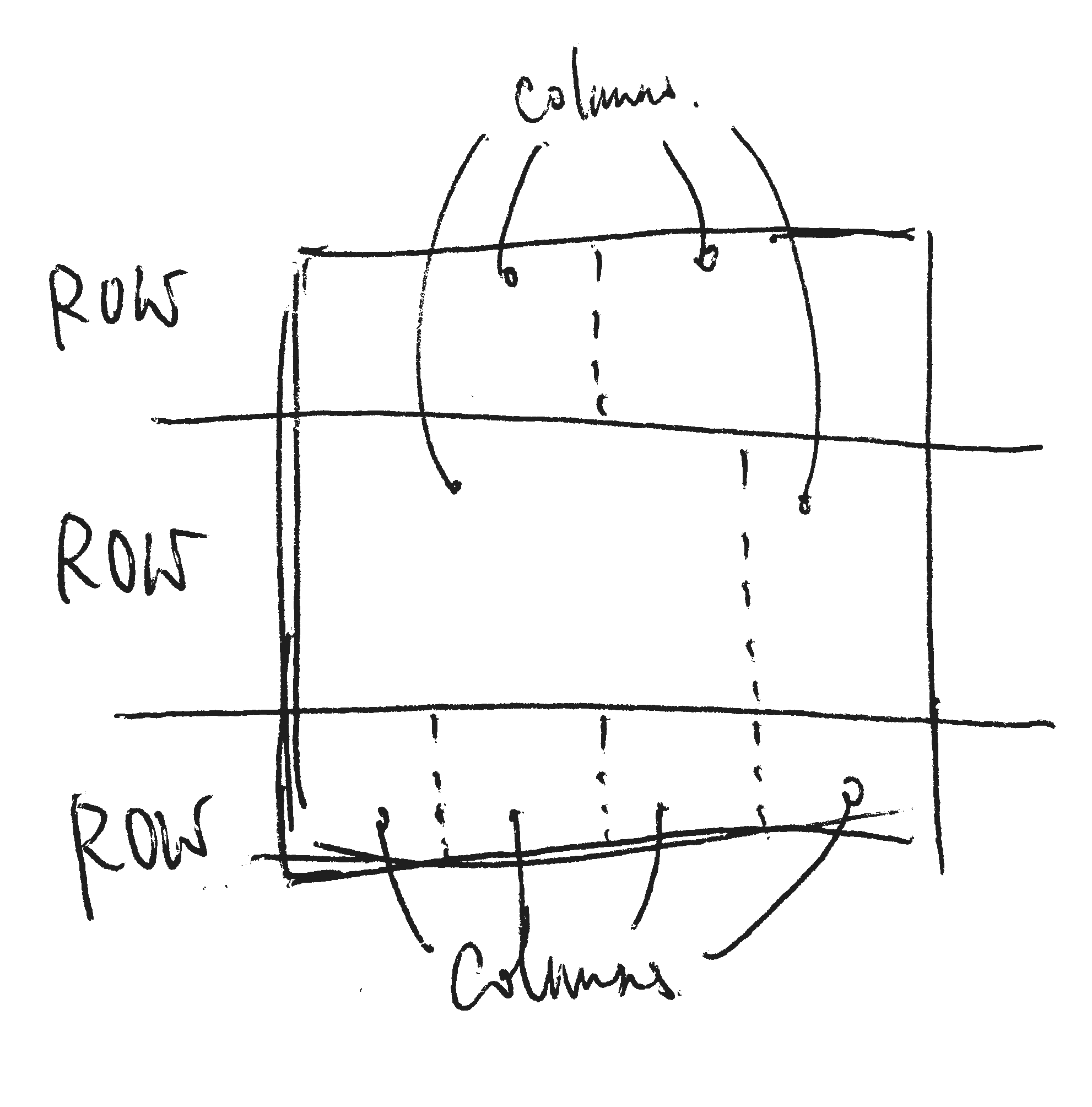
- Rows are the space lay out from top to bottom.
- Columns are the space inside each row, lay out fro left to right.
- All content are put into columns.
-
2018-02-23
Useful link: 7 Practical Tips for Cheating at Design
-
2018-01-06
Differences between `auto-fill` and `auto-fit`
The difference happens when there are not enough content to fill up all columns.
When the screen is wide enough to fill in more "minmax(200px, 1fr)" columns,
auto-fillwill fill extra empty 200px width columns.When it is
auto-fit, extra column works only where there is content there. So there won’t be any extra empty columns inauto-fit.
-
2018-01-04
Block-grid layout with CSS Grid
In this example, we create the block-grid effect by using CSS grid
grid-template-columns: repeat(auto-fill, minmax(200px, 1fr)). -
2017-05-10
Flexbox block-grid example
I created an example that demonstrates block-grid by using Flexbox.
Courses
| Name | Completion | Last updated at |
|---|---|---|
| Introducing jQuery 1st Edition EN | 2019-06-08 | |
| Mobile Web Design 1st Edition EN | 2019-03-20 | |
| 使用 Codepen 快速練習 HTML、CSS、JavaScript 1st Edition 白話 | 2018-05-09 | |
| jQuery 動態網站入門 1st Edition 白話 | 2019-06-02 | |
| Wordpress 入門 1st Edition 白話 | 2017-04-01 | |
| PHP 基礎 1st Edition 白話 | 2017-03-31 |