2018-09-15
📚 Knowledge Library
Tips and Tricks.
All #accessibility #cloud9 #codepen #concept #css #css-basic #css-flex #css-grid #data-url #html #html-form #inspirations #ios #javascript #lang-zh #layout #link #mobile #mobile-web #mysql #php #php-basic #podcast #progress-enhancement #python #resilient #resources #swift #ui-design #user-media #video #wordpress
-
-
2018-09-14
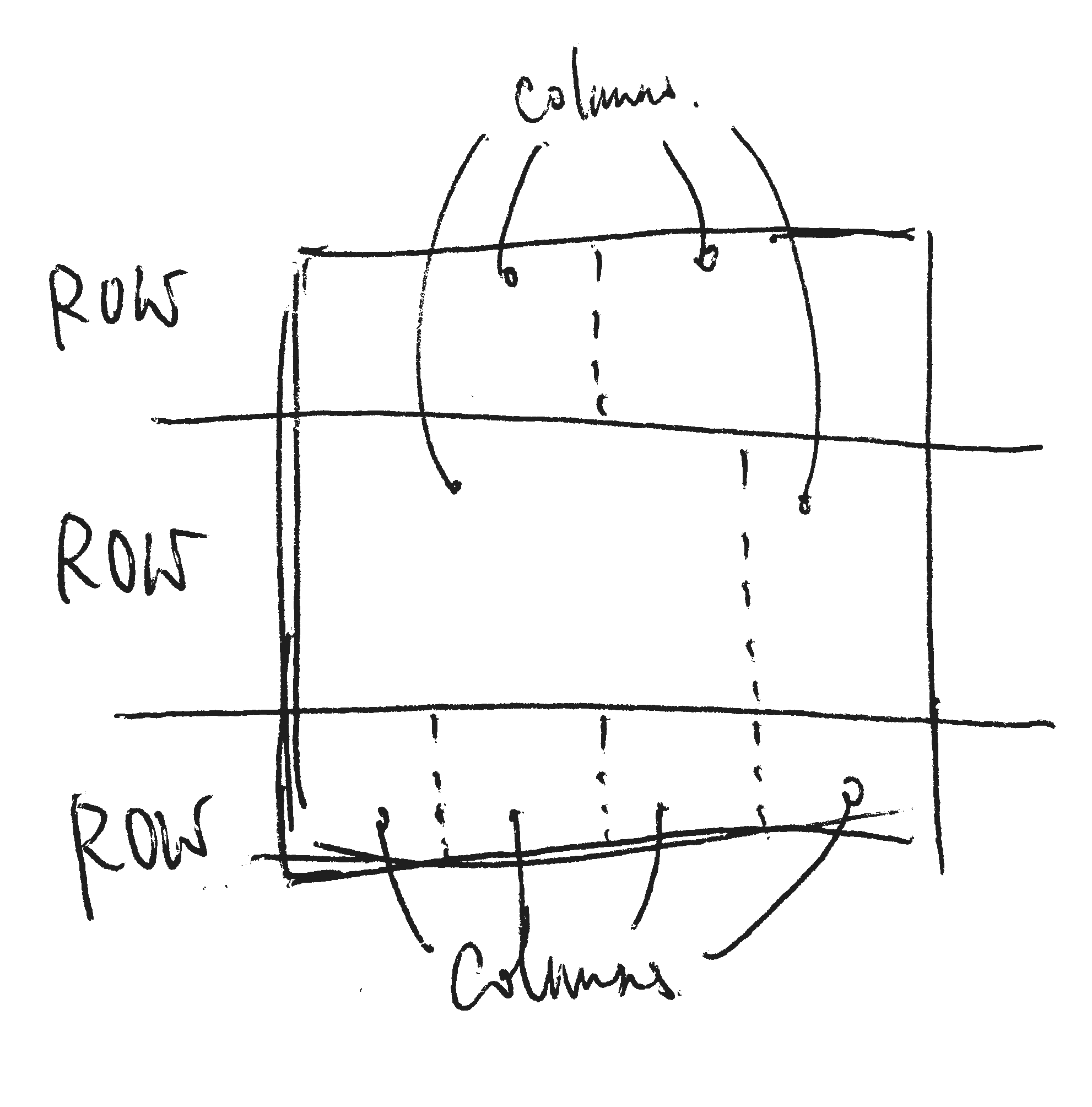
Row and 12-columns grid
Traditionally, we divide our layout into rows. Inside each row, there are 12 columns.

- Rows are the space lay out from top to bottom.
- Columns are the space inside each row, lay out fro left to right.
- All content are put into columns.
-
2018-02-23
Useful link: 7 Practical Tips for Cheating at Design
-
2018-01-06
Differences between `auto-fill` and `auto-fit`
The difference happens when there are not enough content to fill up all columns.
When the screen is wide enough to fill in more "minmax(200px, 1fr)" columns,
auto-fillwill fill extra empty 200px width columns.When it is
auto-fit, extra column works only where there is content there. So there won’t be any extra empty columns inauto-fit.
-
2018-01-04
Block-grid layout with CSS Grid
In this example, we create the block-grid effect by using CSS grid
grid-template-columns: repeat(auto-fill, minmax(200px, 1fr)). -
2017-05-10
Flexbox block-grid example
I created an example that demonstrates block-grid by using Flexbox.
-
2017-05-04
How to disable auto-complete, auto-correct in HTML input
The code that disables auto-complete, auto-correct, auto-capitalize and spell check.
<input autocomplete="off" autocorrect="off" autocapitalize="none" spellcheck="false"> -
2017-05-01
Inspiration: Ire Aderinokun’s contact form template
-
2017-04-30
Quick Video: Demo of customizing CSS in Wordpress
A quick demo:
-
2017-04-29
CSS Priority
-
2017-04-28
2 Examples of nicely crafted input fields
-
2017-04-27
Video: Setting up Wordpress in Cloud9
In this short video, I showed the steps to setup a wordpress development environment in Cloud9. I also add some basic CSS styles on the theme.
-
2017-04-26
Link: EaselJS with StageGL
http://blog.createjs.com/stagegl-faster-better-stronger-webgl-update-easeljs/
StageGL is a drop-in replacement for the CreateJS Stage.
-
2017-04-25
Codepen Link: Upload, Crop and Save
-
2017-04-24
Apple’s LivePhoto Kit for JavaScript
https://developer.apple.com/reference/livephotoskitjs/
<div data-live-photo data-shows-native-controls data-photo-src="https://cdn.makzan.net/IMG_7677.JPG" data-video-src="https://cdn.makzan.net/IMG_7677.mov" style="width:320px;height:320px;" > <img src='https://cdn.makzan.net/IMG_7677.JPG' alt='Sample Live Photo in Macao Science Center.'> </div> -
2017-04-21
Link: Beginner’s guide to Regex and JavaScript
-
2017-04-21
User Scalable?
I created a web page to test if your mobile browser overrides the
user-scalablemeta configuration. -
2017-04-20
AJAX requests and PHP responses
-
2017-04-19
Box-Sizing
*{ box-sizing: border-box; } -
2017-04-18
What is ModernWeb.Design?
ModernWeb.Design is an online mentorship community to learn web design. You can find tutorials, courses, and test projects (exercises) here.
-
2016-09-25
Dealing with long words in CSS
.hyphenate {
  overflow-wrap: break-word;
  word-wrap: break-word;
  -webkit-hyphens: auto;
  -ms-hyphens: auto;
  -moz-hyphens: auto;
  hyphens: auto;
}


